Optimizing Web Pages for Mobile Screens
After building the new VHR site from scratch, I had a new layout that I liked on computers, but it looked terrible on phones.
Because I structured the new site mostly with Google’s Materialize frameworkws, the elements did scale, but because the page’s content was fixed in location, everything got squished.
The first step I took was deciding how I wanted the content to move when it got to a smaller screen size. In my opinion, the best way to do this was not just to make the desktop page smaller, but to have columns stack on top of each other.
Thus, instead of using a format like such (with Materialize classes):
"<div class=“row”><div class=“col s6”> </div> <div class=“col s6”> </div>"<div class=“row”><div class=“col s6”> </div> <div class=“col s6”> </div>"<div class=“row”><div class=“col s6”> </div> <div class=“col s6”> </div>"<div class=“row”><div class=“col s6”> </div> <div class=“col s6”> </div>"<div class=“row”><div class=“col s6”> </div> <div class=“col s6”> </div>
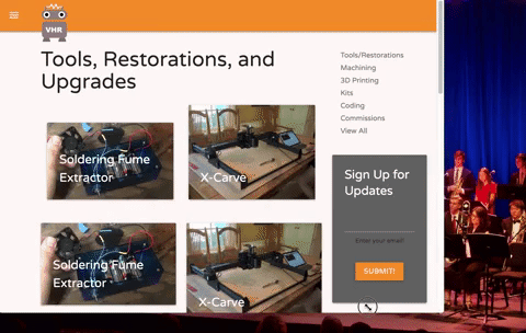
I created a class called ‘project-post’, to accomplish the following: create an object that would scale based on screen size, but would also change the number of columns if the screen was especially small.
Here is an example of the format I was able to use with my own code:
<div class=”project-section”>
                    <a class="project-post" href="./fume-extractor">

                    </a>
                    <a class="project-post" href="./fume-extractor">

                    </a>
                    <a class="project-post" href="./fume-extractor">

                    </a>
                    <a class="project-post" href="./fume-extractor">

                    </a>
</div>
Much simpler, right? This way, when I was hard-coding things in, I would have to keep track of way less code and format.
Additionally, I was now able to control the properties of each object in each row and column as opposed to grouping them.
I messed around with CSS, discovering properties such as width, padding/margins, and display:inline-block to be useful.
Here is the final CSS for the objects on my Projects (link) page:
.project-section { margin-left: auto; margin-right: auto; margin-bottom: 20px;}.project-section:after { content: ""; display: table; clear: both;}.project-post { width: 27%; margin-left: 2.3%; margin-right: 2.3%; left: auto; right: auto; display: inline-block;}@media screen and (max-width:1100px) { .project-post { width: 45%; }}@media screen and (max-width: 800px) { .project-post { width: 100%; }}
The @media property allows me to format conditionally based on screen size.